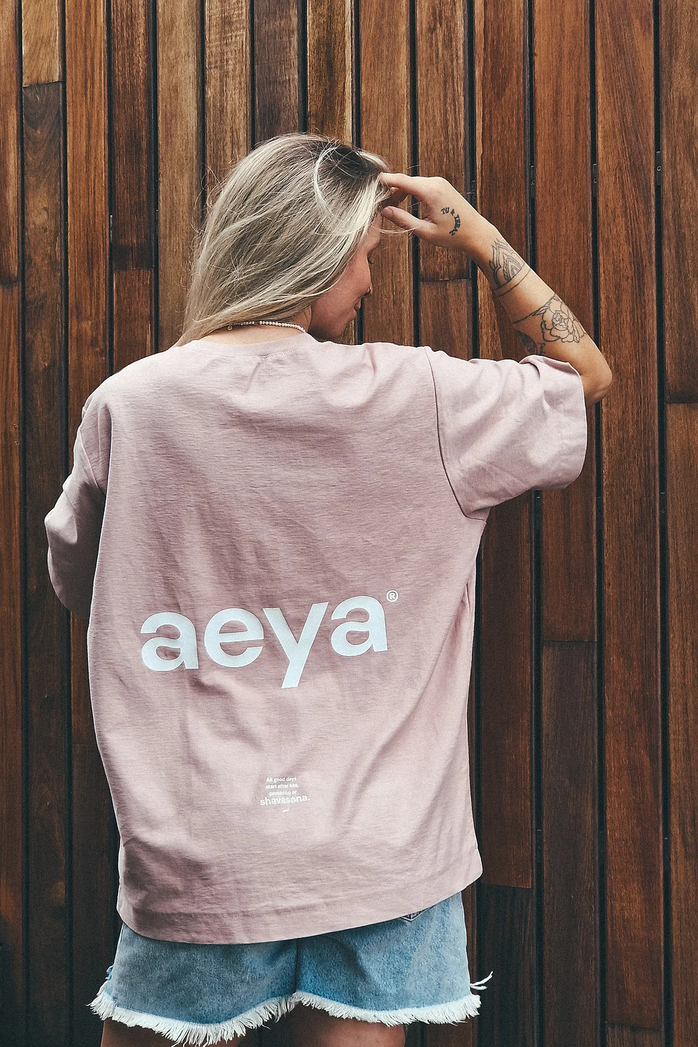
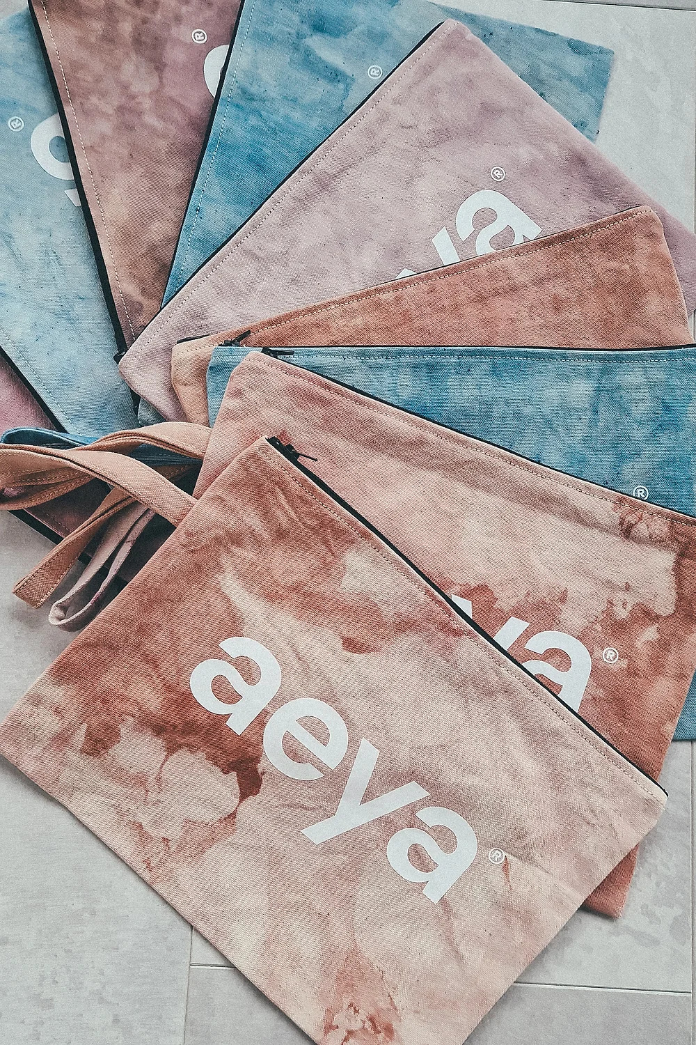
Fashion yoga apparel aeya and its name preserves the identity of each one of you. Each one as a vowel, but together as a whole as unity.
There is an island word "jaeja" ...it is untranslatable and can be appropriate according to the situation and tone. And that's exactly what aeya is.
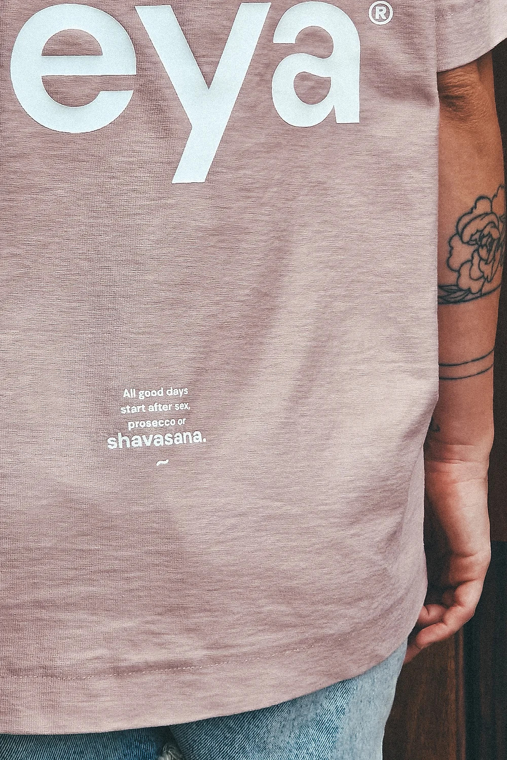
The brand identity embodies balance. The primary symbol of the logo is based on the letter "a". The negative space of the letter consists of harmonic drops that imaginary rotate clockwise, representing time continuity. The space between the drops represents a wave, which refers to the name: piña yoga. This wave symbolizes the center, peace, balance, that is, time for yourself.
The font aeya sans is a modified open source font where selected characters have been modified to the visual concept of the brand.