The catalogue portrays a collection of a glass set for whiskey under the name of IRIS designed by Judit Šustrová and made by Moser glass. The photographs and the graphic design of the catalogue follow up on the very atmosphere of the glass design. The catalogue continually documents set in separate chapters, manual production of glass from the workshop, the whole set in a studio environment and its use in a real environment.
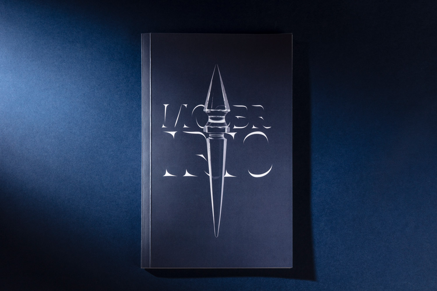
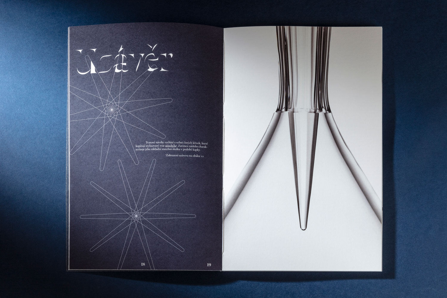
The cover consists of the most distinctive element of the entire glass set, namely the glass closure. The design of the cap is inspired by an icicle and for the haptic experience; a partial glossy finish was applied, which is supposed to resemble a real look of ice. The closure on the cover is displayed in real size, thanks to which the viewer has a better idea of the overall scale of the glass set. The outline of the cap is imprinted in the same place on the back.
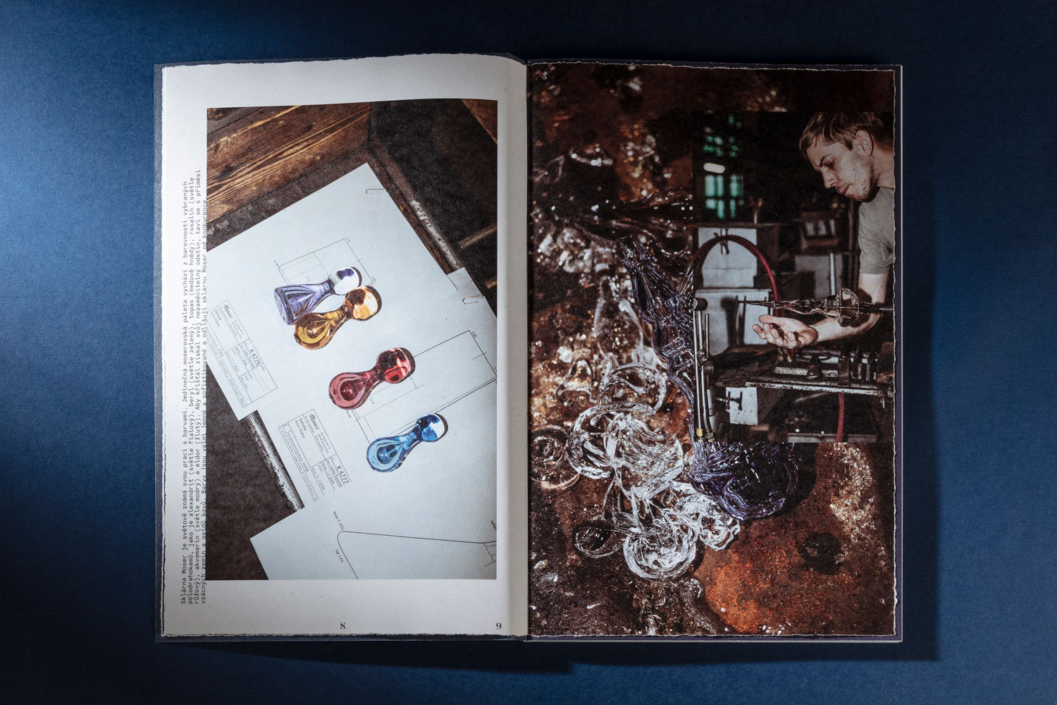
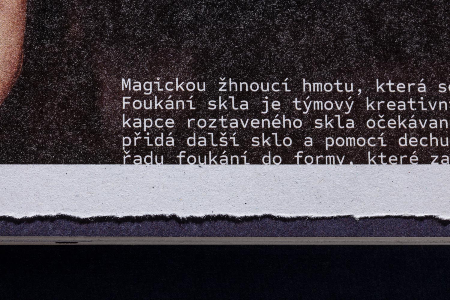
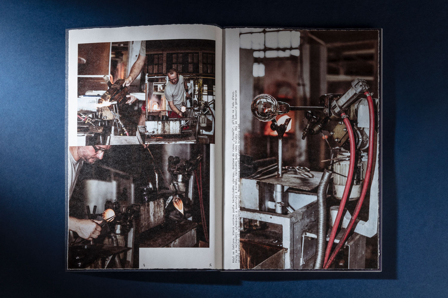
The chapters are in continuous order, each in its design language. Glass production is captured on a rougher and lighter recycled paper Ekoprint 100g/m². This chapter is displayed in a rather relaxed design layout. The harsh working environment also stimulates the trimming of this chapter, which is torn off by hand. The type of photographs in this chapter resembles journalistic photography. This objective is supported by the use of paper resembling a newspaper press.
We applied the actual crushed charcoal to the partial varnish of the charcoal photograph. Thus, black smudges remain on the reader’s fingers once touching the book cover. Our aim was to support the authenticity of his experience in contact with the book.
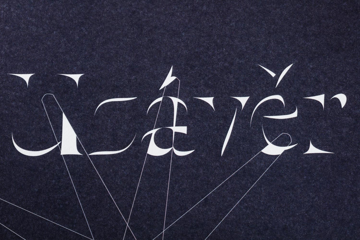
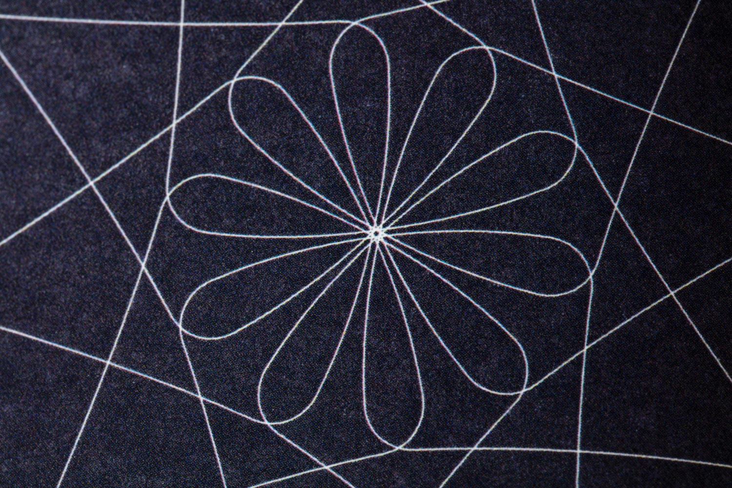
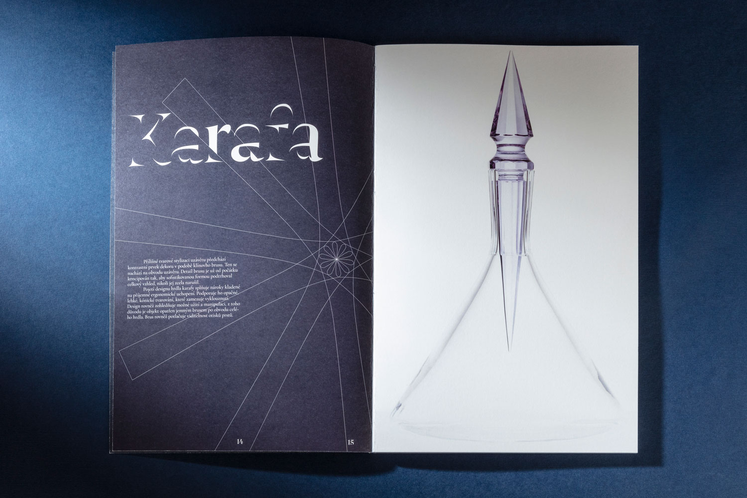
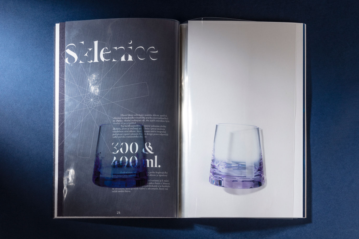
The central element of the entire catalogue represents the work with the refraction of light and cut of the glass. The selected typography of the title is based on the opposite principle when it comes to the combination of cut – offs. The cut of the entire font is selected and the rest of the text is in a section that is “sanded”. The text is accompanied by the illustrations of the glass cut resembling flowers from the individual objects (Carafe, Cap, Glass).
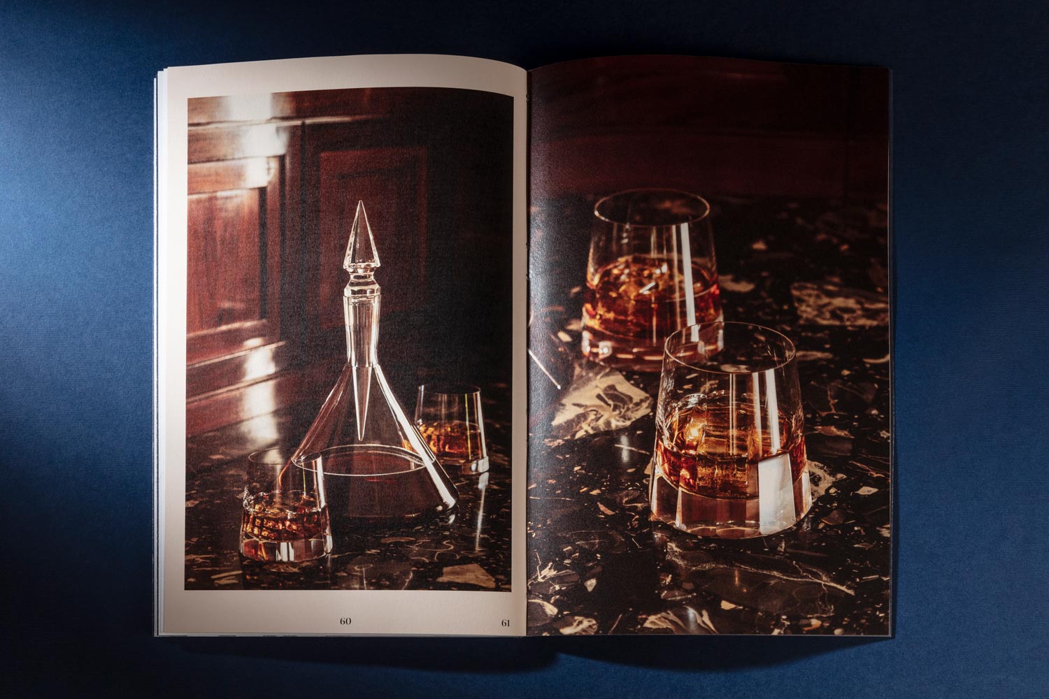
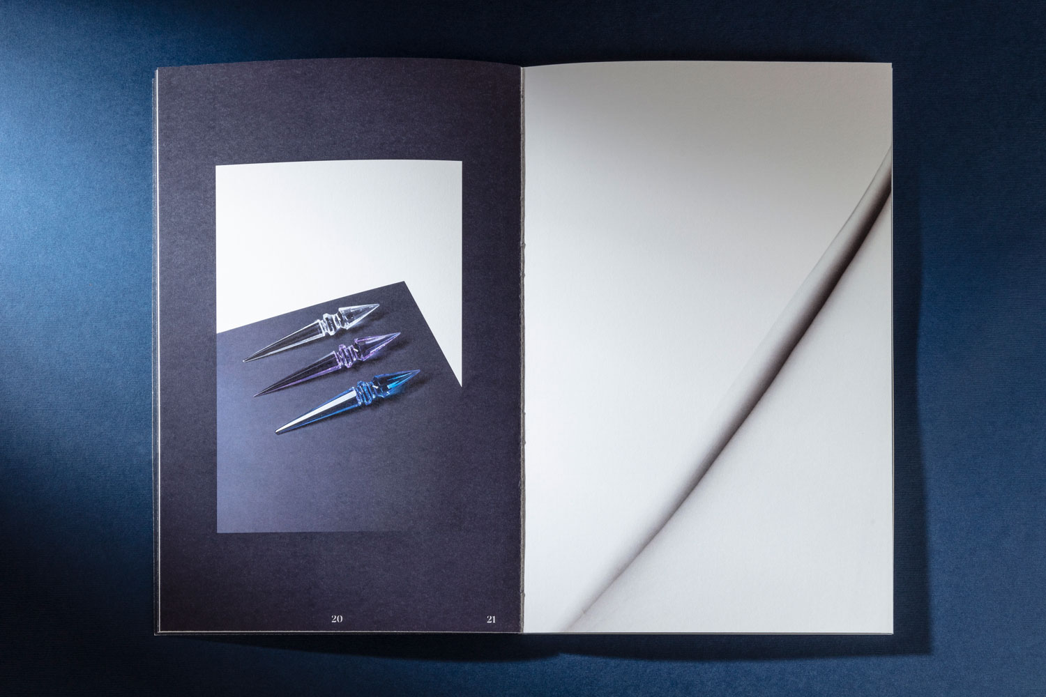
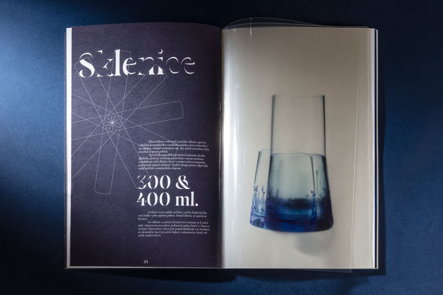
The chapter devoted to the set from the studio is accompanied by a structured layout and design. This approach contrasts with the previous chapter. The chapter is printed on Munken Lynx Rough paper with an oversized weight of up to 300 g/m². The chapter is complemented by the photographs of cups, which are printed on transparent foils to emphasize the material transparency of the glass. Thanks to the inevitability to replace the foundation paper, their use also functions as an interactive element that allows you to view the photographs individually. To support the designer’s inspiration with icicles, imitations of icicles have been made for photography purposes, which playfully appear on photographic compositions.
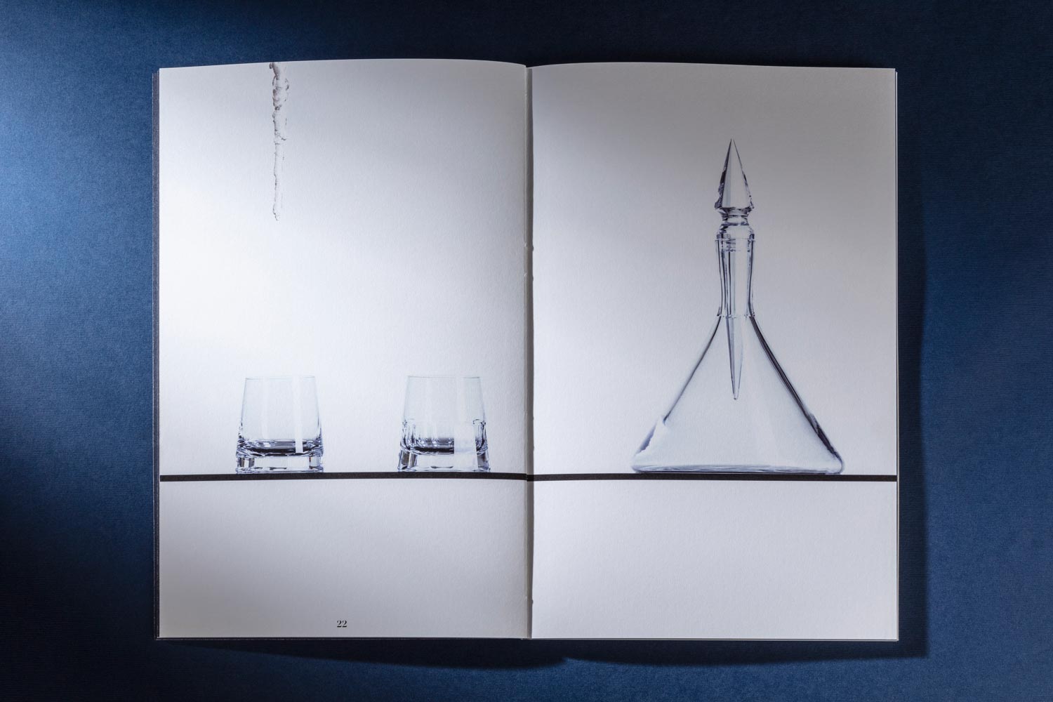
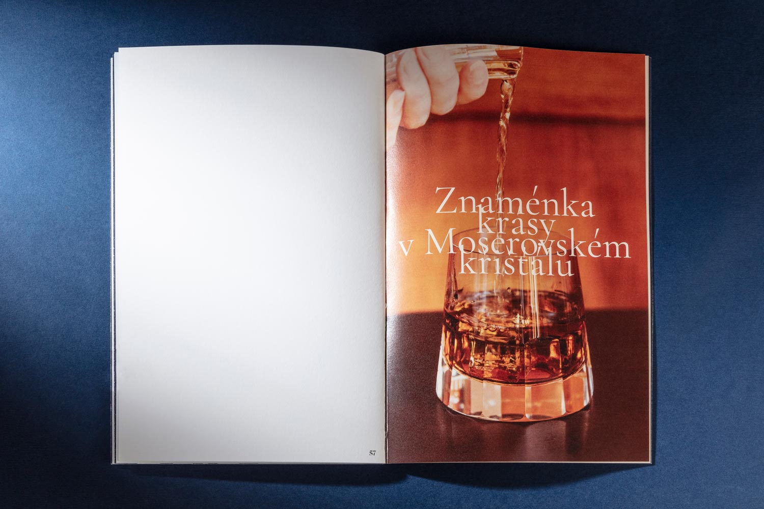
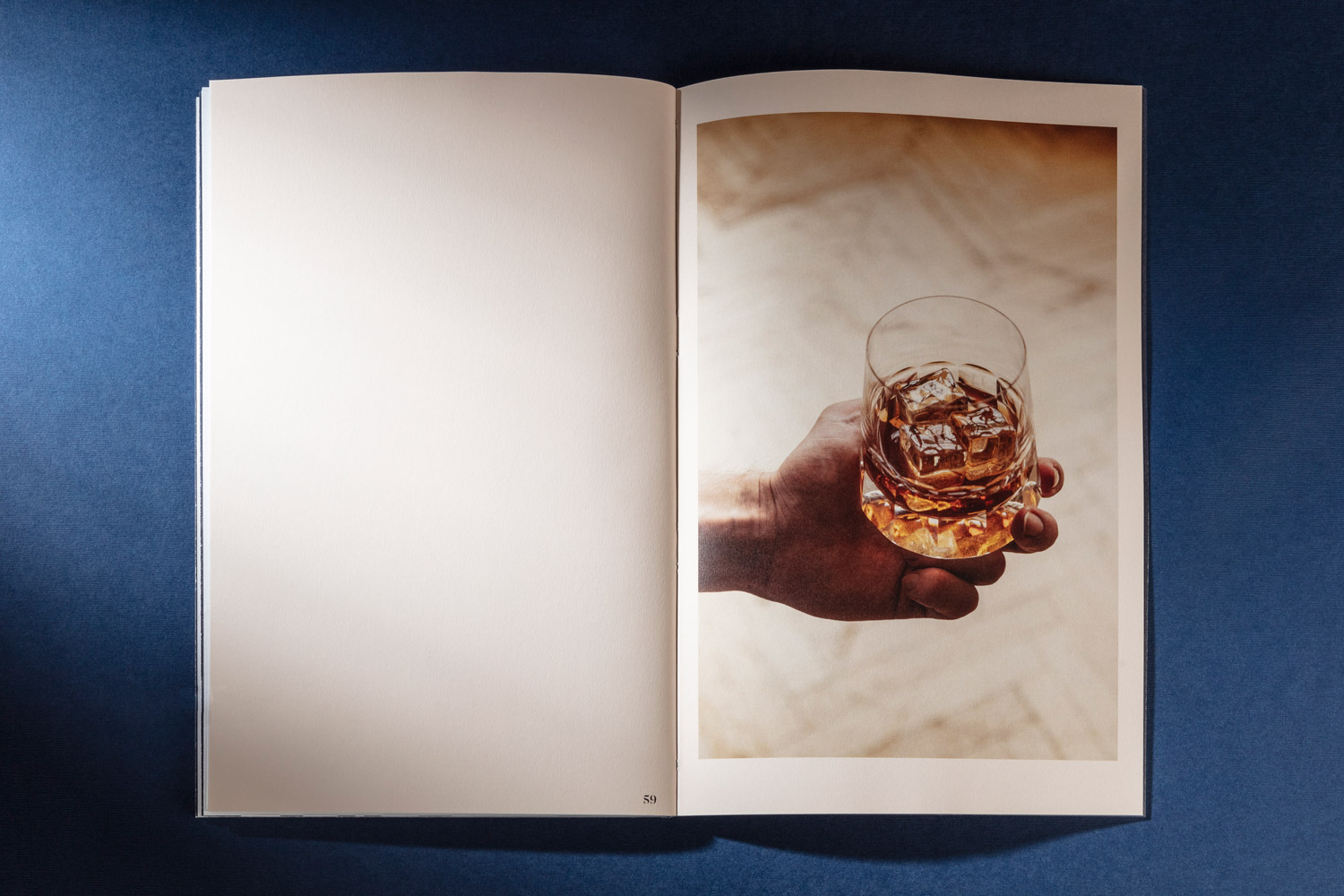
This final passage is austere to the text part and is devoted only to photographs. It is printed on fine beige paper Keaykolour Biscuit weighing 120g/m².