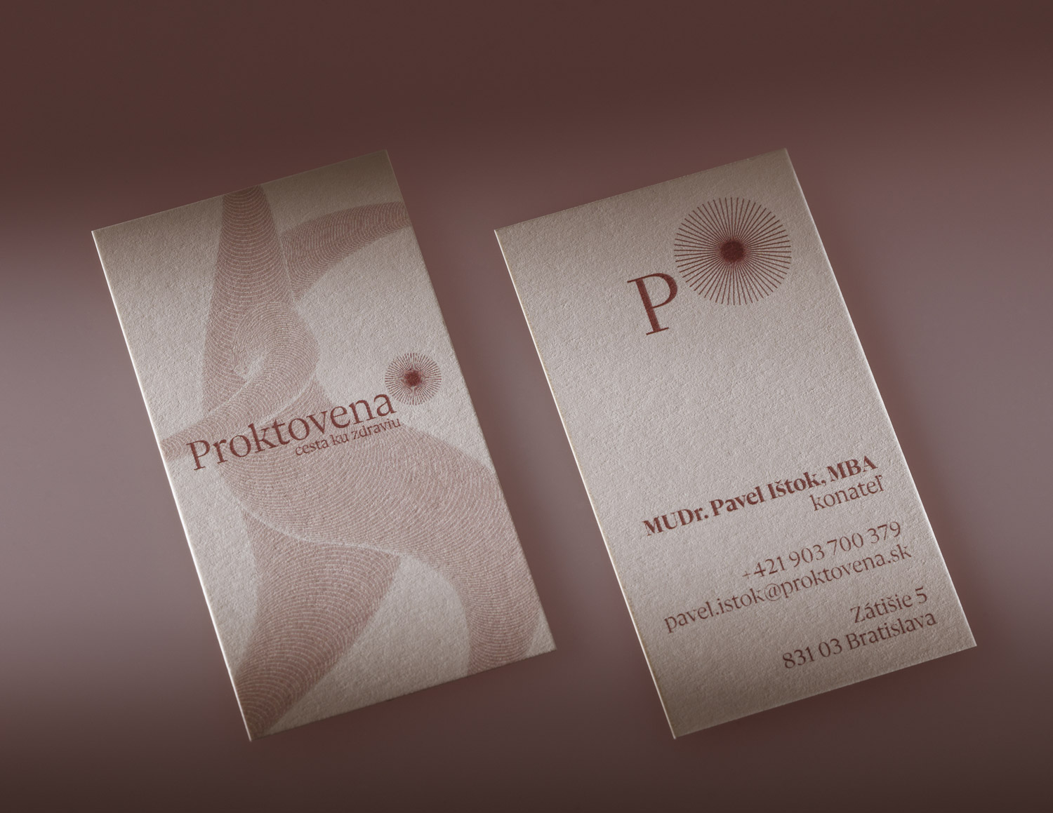
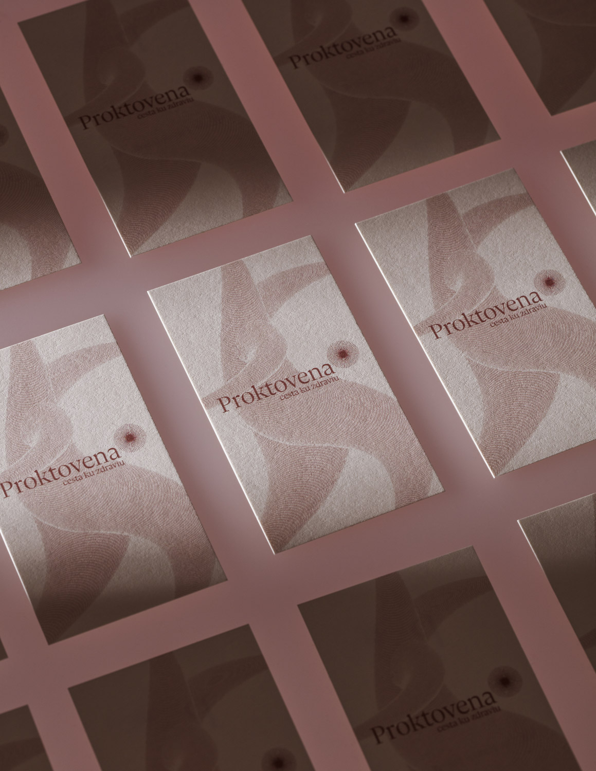
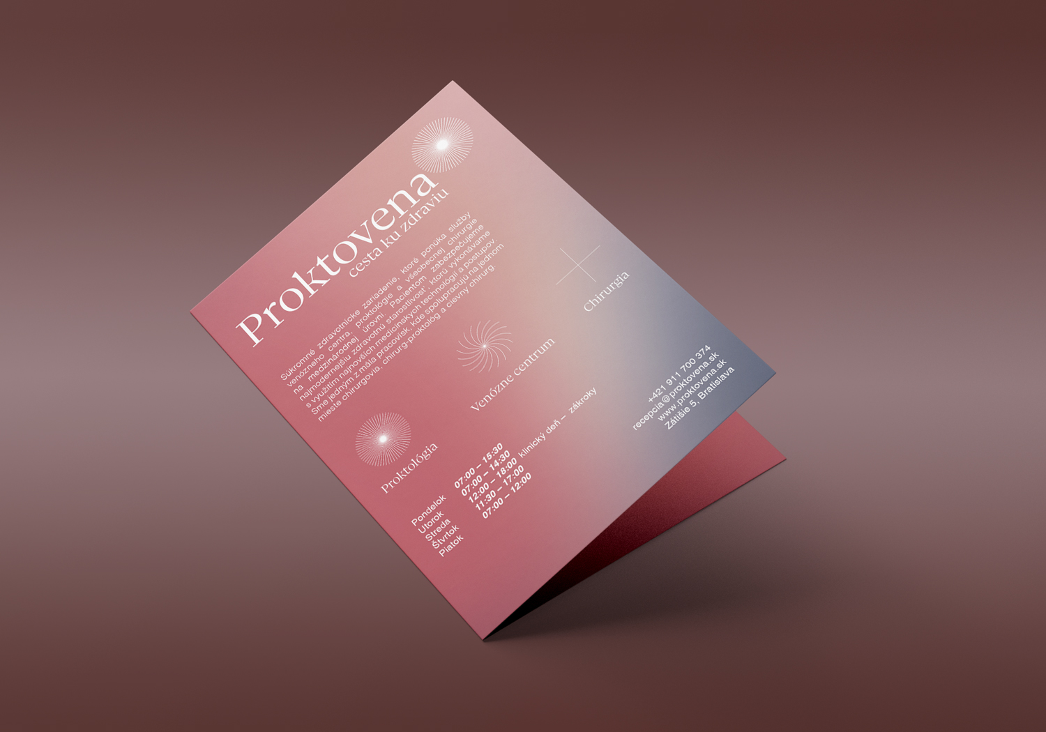
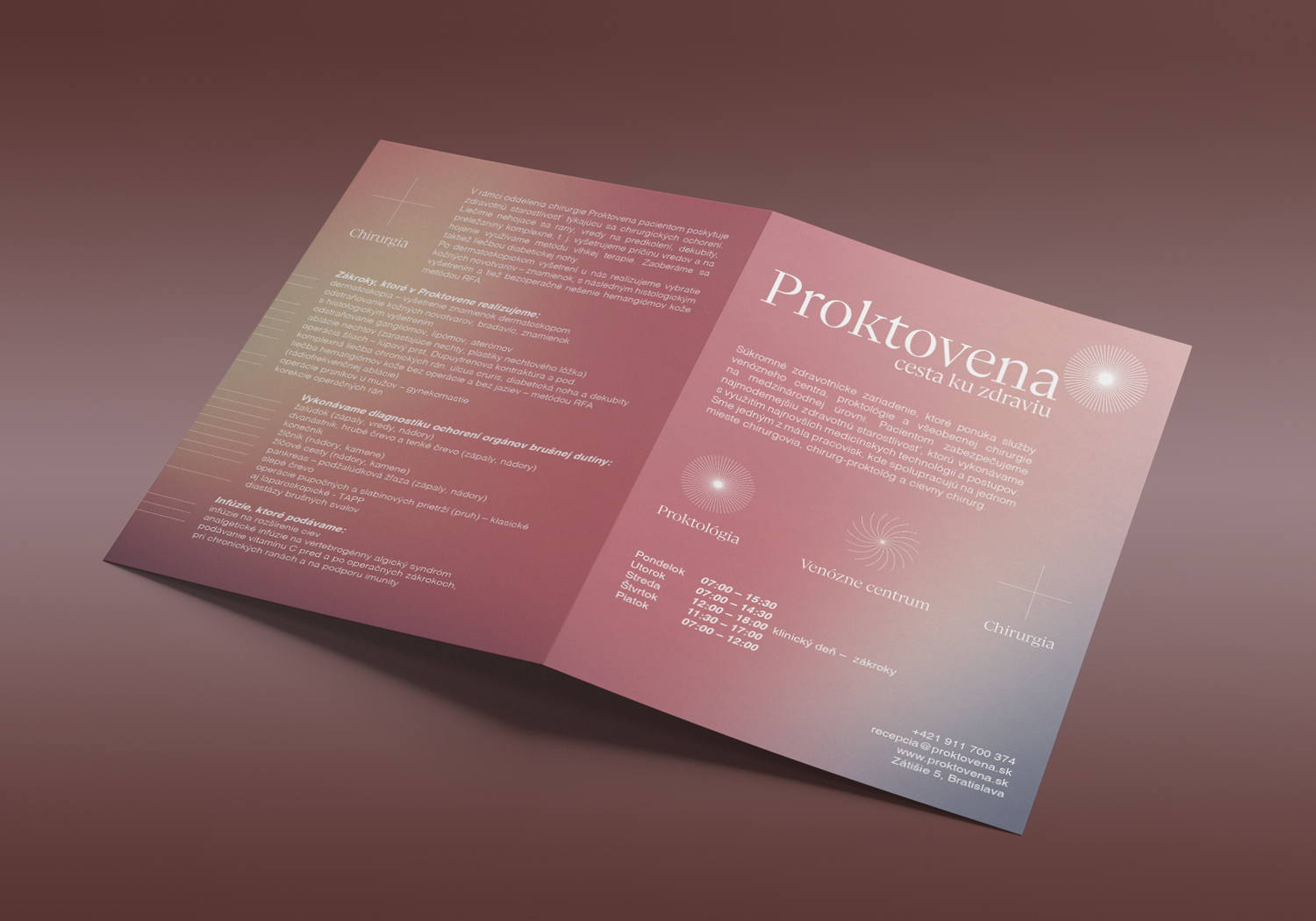
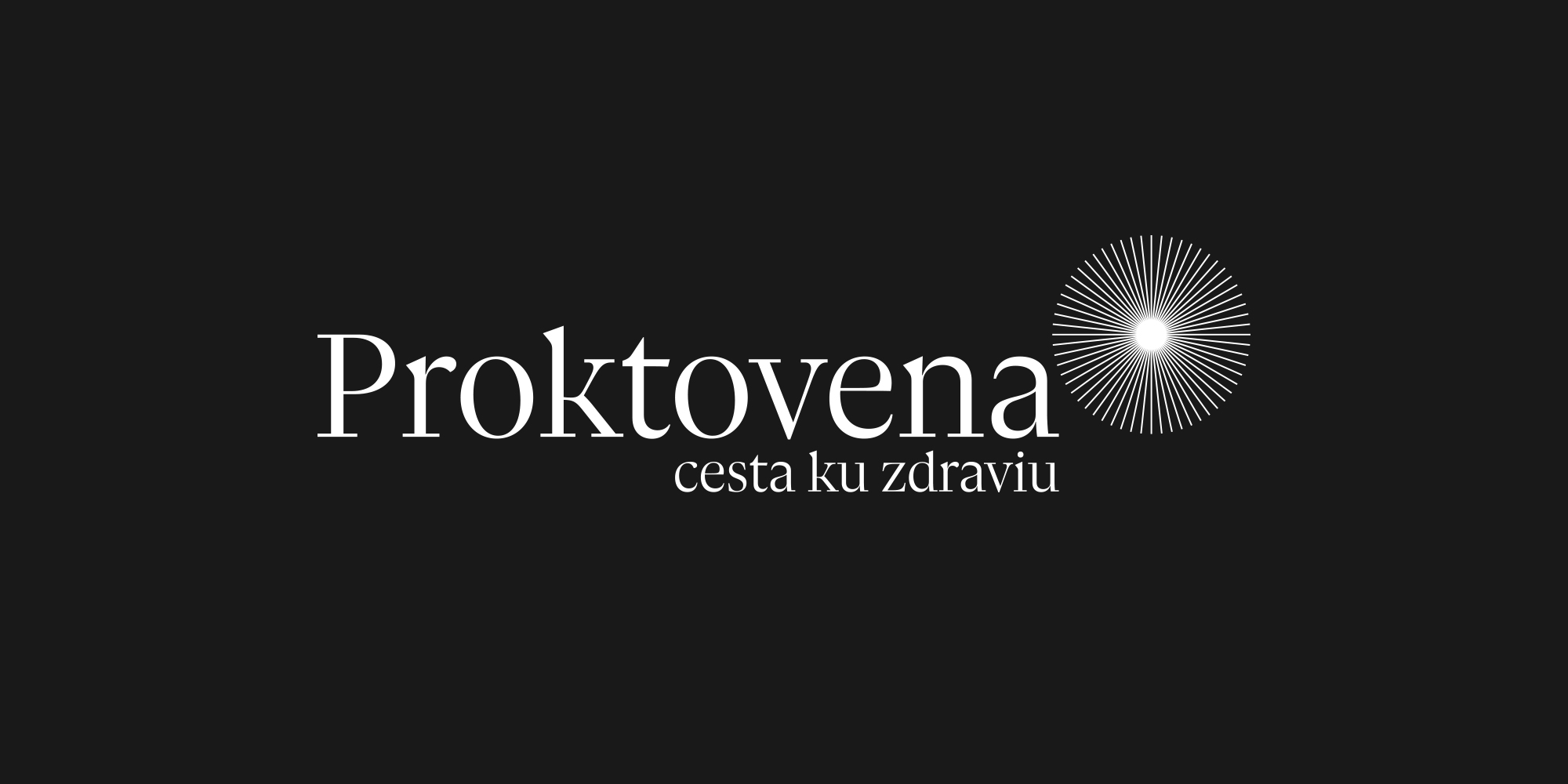
The rebranding of the private health care center, which provides treatment services in the area of colorectal surgery, varicose veins, and general surgery. The main logo symbol represents sun, as a light at the end of disease problems. The lines of the symbol are reminiscent of human veins and the circle of mathematical appearance should evoke harmony. The individual lines of the symbol work with each other by optical illusion. It seems like the lines are moving, pulsing, merging... so it should resembling of health live organism. All this is underlined by a symbol placed at the end of the word Proktovena in the position of mathematical exponentiation.
> proktovena.sk

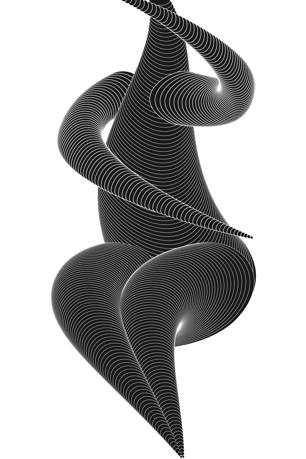
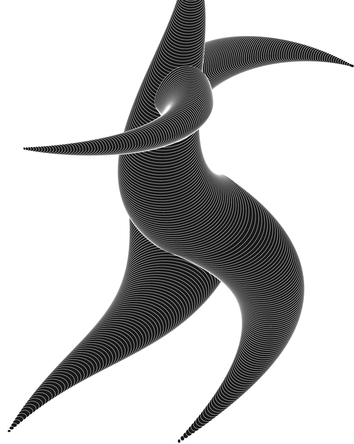
Lines from the logotype are processed into illustrations, which reflect the human body positions. The first figure symbolizes individual suffering from varicose veins and the next figure symbolizes an individual free of this health complication.