
Taky to nehuntuju book 15x21,2cm (quote comes from the czech > movie) is mapping complex issue of taking care of the car. Through 208 pages, author deals with topics as: cleaning, paint treatment, polishing, interior care…so this book is only one of this kind.
The book is accompanied by a color selection of the 10 chapters. Orange, Blue, Green and Pink. The main orange color is reminiscent of a car first aid kit as a symbol of the manual that is always at hand.

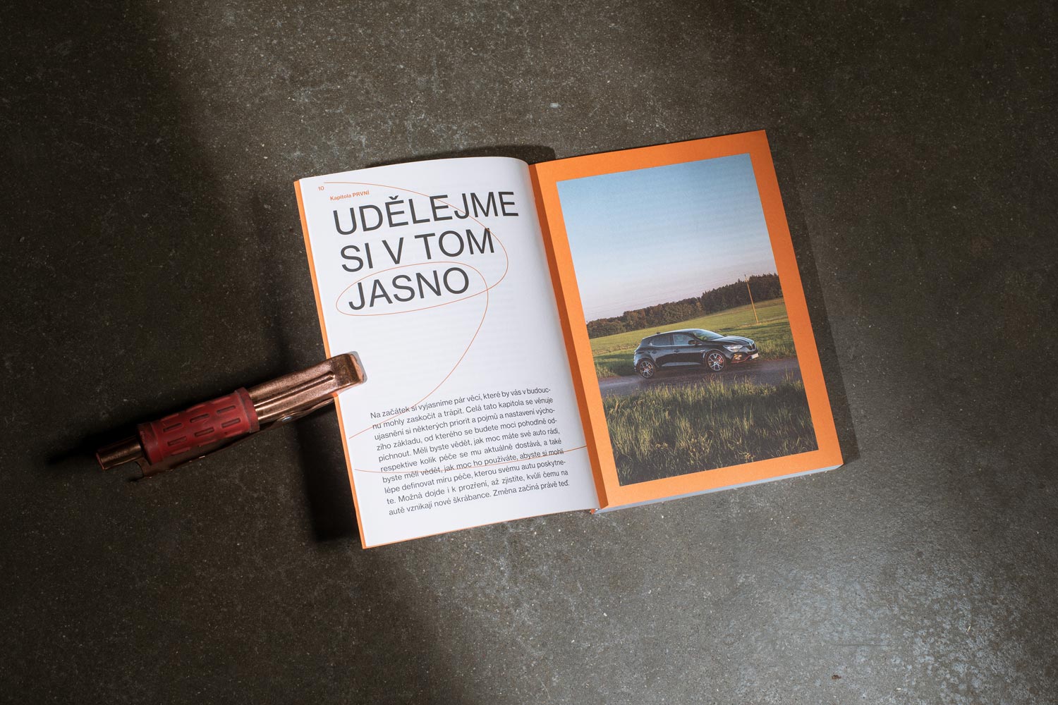
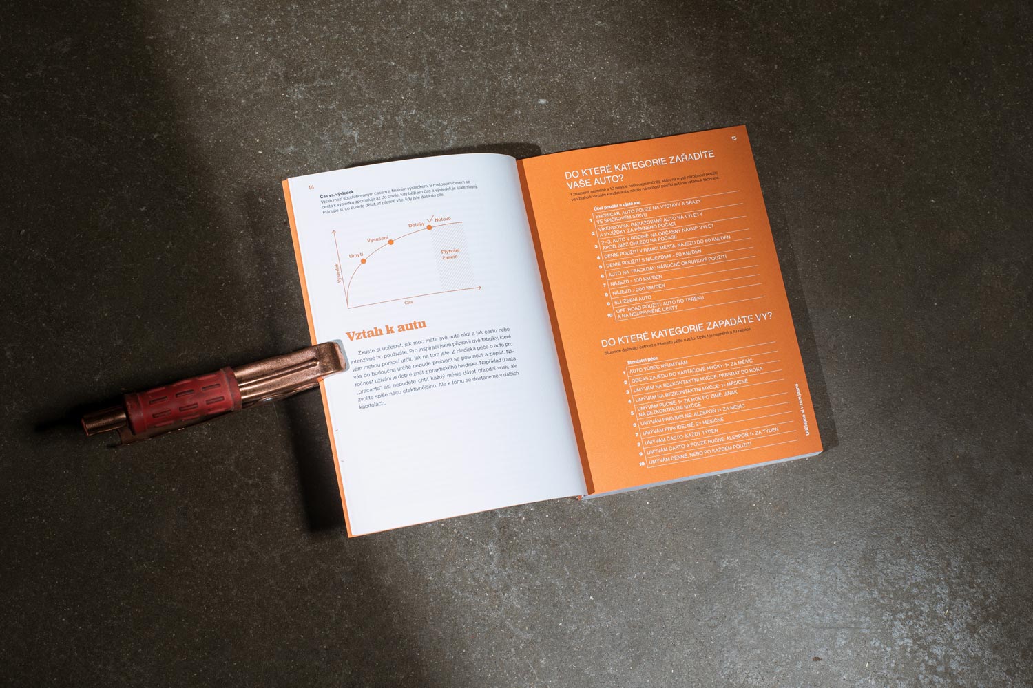
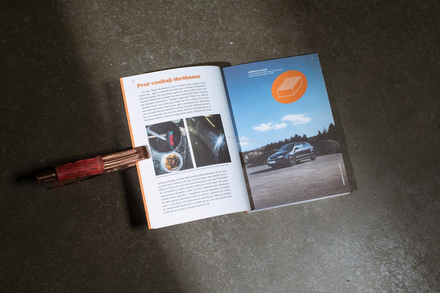
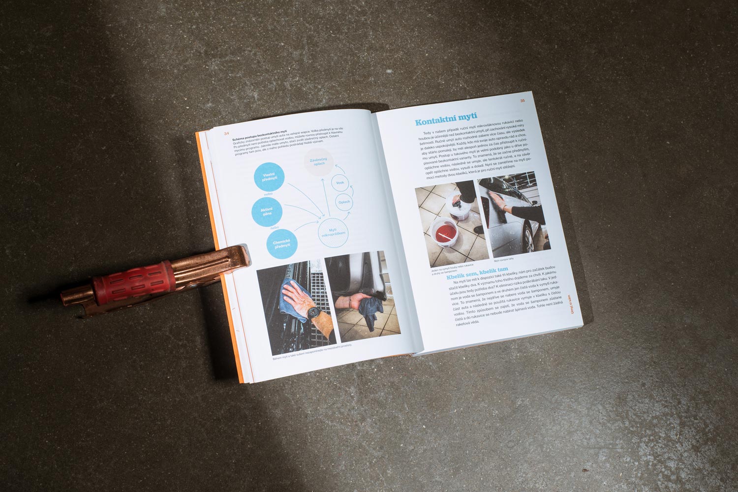
Another graphic element besides of colors are illustrated strokes, which in individual thematic chapters indicate the real movement of the corresponding physical act of care.
These strokes are also used in illustrations and complement the consistency of the design.
The main typeface Neue Haas Grotesk is enlivened by the Jubilat Medium typeface. This duality is applied not only in the book block but its also became a logotype of the project.
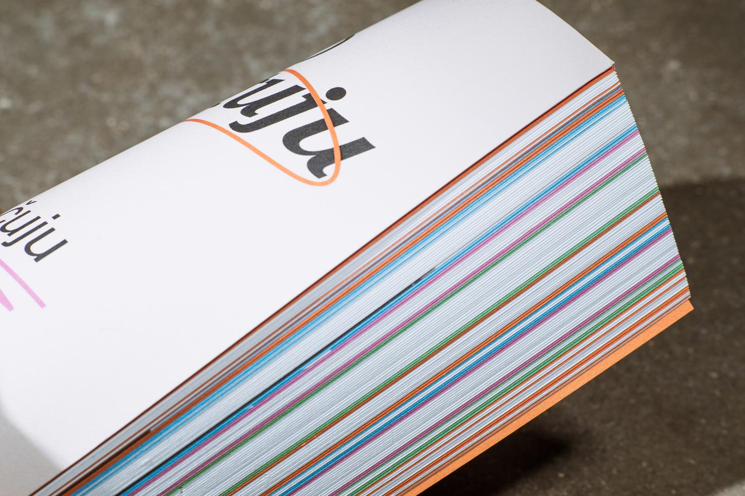
Due to the touch of the surface and the color, the physical version of the book was applied to Munken Kristall Rough paper.